Showing posts with label architecture. Show all posts

Friday, July 31, 2009

Sketch: State Capitol "Flying Saucer" Bank

The Oklahoma State Capitol Bank was one of the more unique buildings to come out of the 60's. Built in 1964, this is the original look of the bank. It has since been pretty heavily modified for security and heating and air conditioning concerns. In searching for information about this bank, I came across a new blog called Oklahoma Modern. I rather like it, so I'll be linking to it. Apparently the author is also a big fan of Julius Shulman as well. Shulman, incidentally, is the one who took this photo.


My sketch, as usual, did not come out very well. I sincerely home my ability improves over time. As it is, my saucers are drooping, my details are scarce, and my car is pathetic. But I persevere in hopes that one day I won't completely suck at sketching buildings.

Wednesday, July 15, 2009

The Cube Project (Seven to Sundae)

Following our exploration of The Golden Ratio, my Professor assigned us a task where we would need to take 3, 5, or 7 cubes that were proportional in Golden Ratio to one another, and place them in a way that was reflected Golden Proportion as well. Of course, being a bit of a nut about architecture, I'd already started thinking about this project before it got assigned, because there was a brief mention of it on the syllabus. My original concept was actually to have 2 Golden Ratio cubes intersecting, so that together they formed the footprint of a larger cube, and that the intersection between the two formed two other cubes of golden ratio at the corners. That would be a total of 5 cubes formed. In my head it worked beautifully. I started with a 1" cube, and did exact measurements to determine what the size of each cube would be...

1"
1 5/8"
2 5/16"
3 3/4"
6 1/8"

Then I fired up Google Sketchup and began to arrange the two cubes to fit in the larger third, and suddenly realized what an entire paper on the Golden Mean should have taught me: Two Golden Ratio Cubes (GRCs) forming a third larger one in GR will not intersect with one another.

Oops.

I was going to abandon the idea in favor of something simpler. Then I thought, "why not just work with the mistake and learn from it?"

So I did. I created a third, smaller cube in GR to the smallest, and figured out that I could not only use it to connect and intersect with both main cubes, but that it formed two smaller GRCs in the intersection. Perfecto! And it made a total of 7 cubes, even better! All I needed to do was adjust my sizes, the 2 largest GRCs would up the ante a bit.

1"
1 5/8"
2 5/16"
3 3/4"
6 1/8"
9 15/16"
16 1/16"

I finally created sketches to illustrate the idea. It had a little supporting column in back that would intersect the rear cube to create the 1".


It should be noted that my skill with Google Sketchup is minimal at best, so that's why the sketches are so messy. But they conveyed the basic idea and would serve as fine references for the purposes of measurement. I sent an email containing the plans and concept idea to the Professor and hopped in the car. It was time to go buy the materials.

I figured this would be perfect. I'd use floral wire to create the cubes in wireframe, and then wrap them with 3 different primary colors in cellophane. The overlapping cellophane colors would in turn create a new color, like orange, purple, or green when they formed a cube. It would be a brilliant experiement in light. w00t!

It seemed quite simple in my head.

In reality, it was not nearly so simple. The first two hours were spent wondering how to get the floral wires to connect to one another. I eventually figured out I could twist and braid them together but it was a slow process that yielded messy results.

The first cube should have been my indicator that this could not end well for me. But I figured any bends and messes in the model would slowly resolve themselves once I tightened up the connections, wrapped on the cellophane, and snipped off the corner bits... sure, sure. I continued working...


I truly hate it when Picasa Web server rotates the images automatically. Anyway, it's not important... the finished wireframe looked like crap, and it was going on 8 hours since I'd laid out the materials. Still, I stubbornly pressed on, having hit that stage of not caring, rather I just wanted the thing to be over and done with.


I think this part gave me a little hope. Even though the wires looked like crap, the cellophane effect was pretty cool... at first.

Again, Picasa Web server rotates my photo for me. I hate you, Picasa. Anyway, the effect of the cellophane worked about as well as a raw potato put into in a soup with too much salt. It doesn't make the soup taste any better, but at least at the end of 11 hours, I felt like I'd actually tried my best, even though I wasn't finished. It was awful. I was ashamed of what it looked like, but at least the theory from paper had been proven as possible. But the difference between proving a concept and demonstrating it professionally is the difference between "reciting a hilarious joke verbatim in monotone to the blank stares of coworkers" and "bringing down the house at the Apollo." Sunday closed with me trudging off to bed, knowing the project would be due Thursday, and that I would be turning in a massive disappointment as my first major project.

Monday, the plans I'd sent to the Professor were replied to. She wanted to discuss the project with me. I met with her after class and she gave several helpful suggestions that I'd fervantly wished I'd gotten before I started the project. Still... her advice gave me new inspiration and ideas, and I realized that my biggest failure on the project had not been in the concept, or even technically the implementation, but in the materials.

Floral wire SUCKS for making cubilinear structures that are supposed to support themselves. The Dernier strength is such that it will barely even support itself and it does so with a telltale curve under the gravity of its own weight. It's difficult to cut, because the wirecutters don't cut string well, and scissors won't cut wire, so you have to use two tools for every cut. And the only way to join it to itself is to braid it with messy pigtails that, when you snip them, result in the joining between two separate wires to be lost.

I realized what I needed was a material that was easy to cut, easy to measure, can structurally support itself well, and is already a level plane. It needed to be light and relatively cheap. And since it was about ten o'clock on a Monday night, it needed to be able to be bought at Wal-Mart.

FOAMBOARD!!!

I arrived back home around 11 PM with several rolls of scotch tape, several sheets of black foamboard, white foamboard, and some red posterboard. This time I didn't even mess with the camera and trying to document my steps. I was a man on a mission.

I used the same concept for the plans but made a few adjustments. Since the cubes would no longer be transparent, they would have to be implied by their footprint. Since the "cutaway" view was allowed, I could use vertical walls for the largest cube as support for the two "floating cubes".

Best of all, the Professor recommended I simply use a Fibonacci sequence for the GRCs rather than the exact measurements I had before. This made measuring considerably easier, since the smallest unit I had to worry about now was 1/4" (the thickness of my foamboard). My new measurements were now:

1"
2"
3"
5"
8"
13"
21"

When the final piece had been slid into place, I stepped back and looked at the clock, 5:45 AM, Tuesday morning. I then grabbed the camera and snapped some photos.


It looked kind of like a Chocolate Sundae. Vanilla ice cream, chocolate sauce, and a cherry on top. Since there were seven cubes altogether, I called it "Seven to Sundae". I then went and laid down for an hour's worth of sleep before going to work.

I brought it in Tuesday evening for class and the Professor examined it for some time, pleased with the work, said it was adequate for the task, and then challenged me to improve upon it by taking the central floating cube that intersects the two, and rotating it 45 degrees to make the interaction more dynamic. Then the head of the architectural department at the college was asked for his opinion by the Professor, and they began to argue about it. The Head felt it was fine the way it was, that the cubilinear expression of it would be ruined by rotating it 45 degrees, whereas the Professor felt it would be too static if left in its present condition. Both agreed the central cube should have been black.

This got the class itself into a debate from everything about adding a staircase made of GRCs to making the central cube red instead of black or white, to changing the placement of the red cube...

We finally decided upon two things:

First, we would test the concept of making the central cube black first. I've already been envisioning how I would do this, and I believe it can be done with a minimal amount of effort (at least compared to the rest of the structure.

The second thing we decided was that the little red cube should be an interactive part of the model. It can be picked up and rolled, like dice, in any of the other cubes to create a dynamic and contrasting effect.

The 45-degree rotation may still happen, which I'm fine with now. At the time I was horrified at the prospect of tearing apart the whole model to fix one thing that, had I known the new request initially, could have been incorporated into the original design. But that's not the point. The Professor's intent was to, early on, break me of the habit of falling in love with my design. It was also to see if I could rise to the challenge I will regularly face in the business world where you prepare the world for the client on a silver platter and they say "Meh... I don't like this part. Change it." I take her challenge as both a compliment and a new possible way to see the evolution of a concept take on new form.

This morning I loaded up the rest of my foamboard tape, razor, etc, into the car. I'll be bringing them up to the college tonight to see what we can make of this. I also brought the camera. Hopefully I'll have some good photos of the result.

Monday, July 13, 2009

Sketch: Resort at Punta Ixtapa

This is another masterwork by Diego Villaseñor. This is at a resort in Punta Ixtapa, Mexico (click it to see a larger image), which will almost certainly be our next vacation once I am a millionare. The reason I chose this scene is because Villaseñor shows here an amazing command of simple geometric shapes, shadow, and natural elements. My mind isn't forced to comprehend anything except the view and how nice a dip in that pool would feel right about now. Just looking at this photo makes me feel more relaxed. His counters are present, such as the clay pot in the arched window, but they are subdued, and appear to belong there naturally as part of the context, rather than something contrived to simply be "different" for the sake of being different.

Anyway, here's my humble attempt at sketching his work. (click to see a larger image)

I'm learned a few more interesting things while sketching this. One is how to vary my soft, medium, and hard shadows a bit more. Another is that when you view a ceiling fan, one side will look fat, the other will look skinny, because of the angle of the blades. I never quite realized it before though in retrospect I have no idea how I could have missed it. While sketching, I spent a good deal of time wondering what was in the basket. Soap? Rocks? Bread? I eventually decided that it must be very tightly rolled towels. Considering the pool and the deck chair, that's the most logical choice.

The coup de grace, however, is the tree trunk on the left. The more I thought about it, the more brilliant it became. It is ironic, because it is a softer shape than the architecture, yet it is a dead tree. The curves and verticals beautifully transition from the floor, up the stairs towards the pool and arched window. The very idea of the dried out, dead tree makes me long for a dip in the pool. But the most brilliant part of the whole thing, that I only just now figured out is that it also acts as a convenient towel or robe rack.

Lastly, this sketch was actually one of the most challenging yet. My sketches are supposed to be freehand, so I can't use a ruler to do my straight lines with. Getting relatively straight, parallel lines, or lines at the proper angles, took many, many tries. And no project is complete without at least one mistake. While scanning this in, apparently the corner got folded up in the flatbed, which explains the white square in the lower right. All in all though, I rather like this sketch, but I love the scene.

Friday, July 10, 2009

The Golden Ratio in Layman's Terms


The Golden Ratio is one of those concepts that is so incredible in its properties, presence, and applicability that the concept of it can easily overwhelm people. One hears the word "ratio of A to B is..." and proceeds to zone out, not hearing the rest, and not caring. But we students of architecture do not have this luxury. The Golden Ratio is as fundamental to our would-be occupation as knowledge of heat and timing is to a cook. Some architecture does exist that does not use the Golden Ratio, just as some cooking does not use a stove or oven, but knowing its use is more or less required knowledge to be able to discuss and appreciate architecture.

What is a Ratio?

So let's start at the most fundamental part. By "ratio" we mean how one thing compares to another. Let's start off simple...

The ratio of 10 to 30 is 1:3

This is not the Golden Ratio, it is merely a simple ratio to explain how ratio plays a part before we get into the specifics of how a ratio can be "Golden".

The ":" is a shorthand way of expressing "(the amount on the left) compared to (the amount on the right)". You find this by figuring out what the greatest common denominator is (10), and dividing both numbers by it. Then simplify both sides. The result is 1:3. What this means is that your small and large amounts will always be proportional to one another in this way.

If you wanted a rectangle that was proportional to a 1:3 ratio, it's sides could be 1x3, or 2x6, or 3x9, 4x12...10x30...50x150... notice how the number on the right is always three times the number on the left.

If you wanted a triangle that was proportional to a 1:3 ratio, your sides could be 1x1x3 or 3x3x1, or alternately you might decide to use a 1:3 angle for the ratio. Since a triangle's three inner angles must always total 180, if you wanted each angle to be at a 1:3 ratio from the other angles, then you would use a ratio of 1:3:9 (the "3" is three times 1, and one third of 9).

This can be solved via simple equation. Since your base unit (x) is the one all your other units in the ratio will be based off of, you can set up your equation entirely in terms of "x"

x+3x+9x=180
13x=180
x=180/13
x=13.84615...
3x=41.538461...
9x=124.615384...

So your triangle should have angles of roughly 14, 41, and 125. I realize the rounding is off on the 42, but all three angles must equal exactly 180, and even rounding to the nearest hundredth yields only a near-180 sum.

But it also brings up a very valid point: unless you have an extremely precise and accurate need for the Golden Ratio, it does not have to get down into real life measurements of fractions of millimeters. The intent will be easily enough recognized by other architects, and will be harmoniously felt by non-architects.

So what makes a ratio "Golden?"

The idea is actually much simpler than the math behind it.

Instead of using specific numbers, let's use variables "a," "b," and "c" for the ratios.

So any two-amount ratio can now be expressed simply as a:b

In a Golden Ratio, "a," "b," and their total, "a+b" all have a special relationship to one another. The shorter amount has the same ratio to the larger amount as the larger amount has to the total of both amounts.

For example, here is a line divided into two different lengths, "a," and "b,".

If the segment is golden, then the ratio of a to b should be the same as the ratio of b to the total of "a plus b", or expressed mathematically

a:b = b:(a+b).

A visual representation of this would be something like this:
a:b:(a+b)

Sounds simple? The concept is very simple. However, the mathematical properties behind it are incredible. For the purposes of architecture I'm only going to go into a couple of them.

First, to simplify things, the mathematical symbol for the Golden Ratio is lower-case phi (φ). The uppercase form (Φ) is used for the reciprocal of the golden ratio of 1/φ.

The variable equation for the Golden Ratio is:

But realistically, if you want to figure out what the Golden Ratio is on the fly, you need to multiply it by the numerical value.
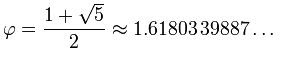
If you just want "quick," it's probably okay to simply use 1.618, or even 1.6. If you want "good," or precise and accurate, then you need to multiply your base value by (1+√5)/2 to obtain a larger amount that creates a golden ratio to your base value. Alternately, you can use the reciprocal and multiply your base value by 1/((1+√5)/2)) to obtain a smaller amount that has a golden ratio to your base amount.

Interestingly enough, the difference between the irrational number values of φ and its reciprocal Φ is exactly 1. So an easy way to keep them straight is to remember if you have a base value and want to go larger up the Golden scale, multiply by 1.618... and if you want to go smaller down the Golden Scale then multiply by 0.618...

Now, the uses for the Golden Scale are nearly endless, but where you'll find the most common use is in the use of rectangles and squares.

If you want to create a rectangle that is in Golden Scale to a base cube, you would do the following:

1. Start with a square (the red area).
2. Divide it in half.
3. Draw a diagonal from one of the corners created by the division, to the corner of the original square.
4. Use a compass to arc it around, then extend the wall of your square towards the arc until it intersects. The total length of that line, from the intersection to the opposite side of the square, is in Golden Ratio to the original side of the square.
5. Simply use this new line as the long side of your new rectangle, and the width of your square as the short side of the rectangle, and you now have a rectangle that is golden proportion to your square.
6. Alternately, you could use the new line as the value to make another square, and have two squares in golden proportion to one another, as I have illustrated below.


Notice how this is not a linear progression upwards, but rather a half-parabola.

The Fibonacci Connection:

Lastly, it's important to know the relationship between a Fibonacci series and the Golden Ratio. In short, the Fibonacci Sequence is derived by adding the two previous numbers to arrive at the next one. For instance:

0, 1, 1, 2, 3, 5, 8, 13, 21, 34, 55, 89, 144, 233, 377, 610, 987, …


0+1=1, then 1+1=2, then 1+2=3, then 2+3=5, then 3+5=8, etc...

As these numbers get larger, the relationship between any two adjacent numbers in the sequence approaches the Golden Ratio. Try it and see...

8/5 = 1.6
13/8 = 1.625
21/13 = 1.615
34/21 = 1.619
55/34 = 1.617647...
89/55 = 1.618181...

As previously mentioned, since in Architecture, the intent and approximation of the Golden Ratio are more important than the exactness of the numbers, the Fibonacci sequence provides a convenient set of Golden Ratio numbers to use.

However, one is certainly not limited by that Fibonacci Sequence. Instead, one might decide to start with a base of any number, multiply it by phi, then take the result and multiply it by phi, and immediately, a new Fibonacci series becomes apparent...

10*(1.618)=16.18
16*(1.618)=26.179...
26*(1.618)=42.358...

10, 16, 26, 42...
(10+16=26), (16+26=42)...etc...

So the Golden Ratio and Fibonacci Series are intimately associated with one another.

a Fibonacci Golden Spiral

There are countless other odd relationships and facts that make the Golden Ratio interesting to not just architects, but also mathematicians, physicists, biologists, artists, musicians, and every other walk of the higher arts and sciences. It is little wonder that it should play such an important role in an architect's education. Though some architects, like Frank Gehry, eschew the Golden Ratio in their own works, the same way a cook might forswear the oven and stove in favor of the grill or the fire pit, the essential knowledge of it is vital to our occupation.

Monday, June 29, 2009

What Happened to Monday's Entry?

After such a great last couple of weeks I felt terrible about not getting Monday's entry out until 10pm. Each weekend I like to take the family out to a new location or three, and take as many photos as possible. Then, throughout the week, I'll organize them into separate entries and post them. Well, unfortunately, I smashed my toe up pretty bad early Saturday, which made walking around anywhere pretty much a wash that day. Sunday was already spoken for, so when Monday rolled around, I literally had not a single photo of my own to post. I figured, eh, I'll just do one of those stream of consciousness things, maybe type something up during the slow time at work. That's when I found out about the ant infestation at my desk.

Anyway, point being, we didn't get out to get any photos until tonight. So bear with me. I'll try and have Tuesday's entry up much earlier than today's, and by Wednesday we should be back on the usual 7:00 AM posting schedule again.

As for what this photo is, if anyone could tell me, I'd be curious to know. We just call them "Road Spiders" cause they always seem to be beside roads, and...er...they look kinda like spiders. But some of them have those four oil barrels on the pillars, some don't, and their use isn't entirely clear, though I strongly suspect it has something to do with paving roads with tar or something.

This week I'll be focusing on points of interest in the local Mid-Cities area.

Monday, June 22, 2009

Three Great Architectural Father's Day Gifts

No dreaded tie for me! Three architecturally-related Father's Day gifts made this the best one ever: The Sims 3, a book on Frank Lloyd Wright, and a 2008 Kia Rondo. But what do these have to do with architecture? Trust me, my friends, and read on:


Okay, so the book was probably pretty easy to guess as to how it was architecturally related. If there is a single architect in the world who hasn't heard of Frank Lloyd Wright, it would be like finding a Physicist that never heard of Einstein. "Frank Lloyd Wright", by Spencer Hart, reads in landscape, like many of its kind.


The book is divided into a short biography of Wright, followed by an extensive series of plates that feature photos from many of his greatest works, as well as some of the actual plans, sketches, briefs, and so forth.

Wright's sketches are perhaps the greatest treasure to be found in this book. The notes along the sides, the details put into each and every inch of the place, the immaculate penmanship--each is a glimpse inside the mind of the man who revolutionized the entire industry.


Also are several panoramic shots that spread across both pages, giving an expanded view of the environment surrounding the structures that Wright designed. It becomes increasingly obvious with these photos that Wright not only understood the environment surrounding his works, but loved it, and wanted to frame it, as much as it would frame his works. Neither ever appears to work against the other. A perfect tandem like this should be the goal of any architect. This book makes a fantastic addition to any collector's library. (You can buy it here).

So what does the Kia Rondo have to do with architecture?

Well, as it turns out, my little Echo that I've been driving and loving for the last 8 years needs a new transmission, and rather than spend the thousands to get it replaced, the wife and I decided it was time to bite the bullet and get a new car. The problem is that I needed something that will last me for years and years, get acceptable gas mileage, has good passenger capacity, and can carry large architectural models around in an enclosed environment with easy loading and unloading. It also needed to be capable of long road trips and movement around construction sites, camp sites, etc. This pretty much left me with choosing from SUVs, station wagons, covered wagon pickups, and vans. None of which typically get very good mileage (usually less than 20mpg here in the USA). Then my wife pointed out the Kia Rondo. It gets acceptable mileage (23+ avg), seats up to 7, and has an enormous back cargo area capable.

I mean look at the insane amount of space in this thing. You could fit a model of an entire neighborhood in here plus the presentation materials and still have room for the donuts. And that's BEFORE you fold down the second row seats! With the second-row seats folded down you could go ahead and throw in all your folding tables and folding chairs, and several Vanna White clones to smile and point at your model as you describe the parti. After reading the review from Edmunds and seeing their only cons to the vehicle were "lack of pizzazz," and "questionable resale value," I knew this vehicle was probably perfect. I am not rich enough to need or care about pizzazz, and since this will probably be the car my 2 year old son will be one day driving, I don't particularly care about resale value either. All I had to do was test-drive it to make sure. We found a 2008 for $12,000 at CarMax, I drove it, and that was that. And I mention CarMax because of how incredibly painless the experience was. No haggle. No hassle. No pressure. It was the most pleasant Car Buying experience ever, so I don't mind giving them a nod.

Anyway, that's what the Rondo has to do with Architecture. It's basically a great, inexpensive student car for those who plan on having to haul large delicate models to school and back, and also plan on using the car for the first few years of your career. So what about The Sims 3? What does that have to do with Architecture?

Old-school gamers may realize that the Sim-Franchise did not start with The Sims, it was merely popularized by it. The original game that started it all was Sim City which is now up to Sim City 4 (I don't count Societies). As the name implies, it is a computer simulation game where you plan out a city, and the tiny simulated inhabitants immigrate, emigrate, get and lose jobs, commit crimes, deal with problems like earthquakes, fires, flood plains, etc. It is--believe it or not--actually used by many civil engineers and city managers to help test modern city infrastructure solutions before designing the infrastructure to address them. It's even used by contestants to design a city for the annual IEEE Future Cities Competition. It's also quite a bit of fun.

The Sims, likewise, is a family simulator, that places focuses on one family at a time while they are still in the context of a larger city. By now, at The Sims 3, that environment of city context, people, houses, views, and local community is quite well developed, and houses have become incredibly intricate and varied in their possibilities. So it stands to reason that by now, at Sims 3, one can put certain architectural solutions in place. Though in the first Sims, houses were little more than boxes you could stick furniture in and let your inhabitants walk around, the shape, form, and function of the houses are more important and diverse than ever, and the possibilities are near endless. You can quite literally create a house from the ground up, landscape around it, have incredible arrays of gardens, and what they've done with lighting is incredible. You can actually watch how the shadow of a tree plays across the house through day and night as the sun passes overhead. Rotating around the house gives a view of the entire neighborhood and landscape around it, and with the exchange and creation tools already provided, one can create nearly any texture or look to a house one desires.

Of course the entire point and prefix of architecture is the division of space. How traffic flows into, through, around, and out of the house is of paramount importance in real life, and even more so in Sims 3. You can quite fully recreate just about any house you wish to in here, provided you have the necessary textures and walls. Some of the more extraordinary features might be difficult to pull off. I'm not entirely certain if "Falling Water" could be recreated in Sims 3, but considering the quality and success of this franchise, I don't believe it will take long.

Now, that said, obviously you couldn't build a house purely based off of Sims 3 any more than you could build a city purely based off of Sim City 4. But if you wanted to test a concept, and get a quick view of how something might look, how a family might interact within it, how it fits within the surrounding environment, and how the parti for a house might work, Sims 3 makes a useful (and fun) tool to do so with. Before you dig out the materials manuals, the math books, and fire up the CAD and plotter, try out Sims 3 to test drive your house idea. You might be surprised how well art imitates life.

Friday, June 19, 2009

Friday Feature: Interviewing Bouler Design Group

For our Friday Feature, we interview Bouler Design Group for tips on how to achieve success in architecture and design. Students and Professionals alike will have an interest in this firm's ability to withstand an increasingly competitive market, and how they managed to achieve it through modern environmental methods mixed with traditional designs.


First, a bit about the firm. Bouler Design Group consists primarily of architect James Bouler (RA, AIA), Nicholas Pfluger (Associate), and Nadine Bouler (Creative Team Advisor). Based in Islip, New York, they have been featured in "Leading Residential Architects" by Pamela Lerner Jaccarino, as well as having written numerous articles on their innovative methods of mixing modern environmentally-friendly technologies with the traditional design types required by certain communities.

(above) The Oldfield, NY house featured house in "Leading Architects" (more)

BRANDON: Thank you, Nadine and James. Could you both start by telling us a little about yourselves, your job position(s), and credentials?

NADINE: Bachelors in Art/Architecture History, Masters in English Literature, teaching high school (and a brief stint at local college) since 1994. [ed. Nadine is also an author and has also published a children's book and three young adult novels (more).]

JAMES: Bachelor's in Architecture from Auburn University, and Master of Fine Arts in Sculpture, own practice since 1998.

B: Let's get down to what I and probably every other student is wondering right now, how hard was it to start your own architectural firm?

N: It helped to have one of us with a steady job and benefits (me). James is incredibly motivated, focused, determined so he didn't get distracted. He works well with contractors as well as the clients so that helped him get a lot of word of mouth recommendations. Advertising hasn't worked as well for us. We are still a small firm but that allows James to ensure top quality in terms of design and accuracy, as well as customer service. James has been successful because he's a great designer, easy to talk to, returns calls quickly, and works as many hours as needed to get it done. The biggest challenge was not working 24/7. James is always in touch with clients and contractors so it can be tough to turn it off on weekends, nighttime, and vacations.


(above) James Bouler gives a presentation on sustainable architecture (more)

B: I've heard a lot of debate about RA vs. AIA credentials. Do you find the benefits of AIA membership worth the annual price? If not, what extra benefits would you like them to provide?

N: We have gotten a few substantial jobs through the AIA website so it has worked for us. Having a link to our site made it worthwhile.

B: Not counting college tuition for a BS and possibly a Masters in Architecture, what additional costs can students count on having to pay for licenses, tests, memberships, fees, equipment, software, etc, before they can truly earn a living in the field?

N: If it is your own practice there is a lot of overhead, especially insurance. The computer stuff is the cost of doing business. We've also invested in our own plotter which was costly, but if you work for someone else, that's not as much of a factor. One plus is you can start your practice in your home since most clients meet you at their place.


(above) Lido Beach House proposal (more)

B: So far, I've heard social skills are the most important factor to success in Architecture. What would you say is most important to an individual's success? How about a firm's success?

N: Working well with others does help--though that doesn't mean you should be a pushover. If your role is to bring in work, it helps to network, getting to know contractors, and recommending good ones. In terms of the overall firm, a good product is important. Accuracy is key in terms of the plans and the paperwork for permits, etc. Architects also need to realize that this can be a very stressful moment in a person's life--disrupting their lives for a residential project, spending lots of money--so patience with the client is important. Also, keep the practice diverse. We take commercial, residential, waterfront, high-end, mid-range additions. It helps in uncertain times.

B: Given free reign on a project, what style of architecture would you most like to work with?

N: We'd go green and modern.

(above) Oak Beach, NY house of recycled materials and near zero-carbon footprint (more)

B: What sort architectural and design "features" by others tend to annoy you?

N: Vinyl siding. [ed. This is the number one answer I get from every architect I ask.]

B: Good, Fast, Cheap. Pick Two.

N: Good. The others are optional.

(above) Proposed Bayshore, NY house (more)

B: What's your dream project? The one that you lay awake at night and envision one day having a benefactor to pay for it.

N: A personal chapel, but james is awake at night thinking about getting projects through the DEC more than design problems.

B: What's the hardest compromise you've ever had to make on a project?

N: 1. Cost 2. Clients who don't want good design, or are too insecure to go for something that's not like everyone else.
(above) Westhampton, NY house (more)

B: Are there any vital tools and/or skills you can think of that they don't mention in school that are monumental in terms of time and/or money saved?

N: The ability to write contracts and to handle paperwork is a bigger part of the job than design school indicates--but perhaps that's best. I'm not sure that answers your question though.

B: What did you do with all your old architectural models from school? Did you keep them as reminders, or did you recycle them with each project? Or something else?

N: We have pictures of them in a box, but that was over 20 years ago.

(above) Easport, NY house (more)

B: Have you ever met or worked with any Starchitects, or other related celebrities, such as architectural photographer Julius Schulman?

N: James met I.M. Pei who had a great apartment in the city with a magnificent art collection.

B: Do you have any parting words of advice for students pursuing a career in this field?

N: Remember to remain curious about the world around you. inspiration comes from unusual places.

(above) Islip, NY house (more)

Special thanks to Nadine Bouler and Bouler Design Group for the interview. If you would like to know more about them, please visit their web-page at http://www.boulerdesigngroup.com

Or you can contact them at:

Bouler Design Group
12 Doxsee Pl.
Islip, NY 11751
(v) 631.969.3335
(f) 631.969.3391
(e) boulerdesign@verizon.net

My Shelfari Bookshelf

Shelfari: Book reviews on your book blog